Inter
Clear product language
The main website typeface for headings, body copy, navigation, cards, and UI labels.
font-brandUse this page for the visual foundations and reusable layout patterns of the website: type, colors, spacing, hero structures, sections, tabs, stats, accordions, and CTA bands.
Friday uses Inter for most headings, body copy, navigation, cards, and UI labels, with Source Serif 4 reserved for editorial emphasis and selected hero headlines.
Inter
Clear product language
The main website typeface for headings, body copy, navigation, cards, and UI labels.
font-brandSource Serif 4
Reflective emphasis
Used sparingly for italic emphasis, pull quotes, highlighted words, and selected upright hero headlines.
font-brand-serifTypography keeps exact values because small changes to size, line-height, and tracking are visible in the Friday look.
Hero heading
text-4xl min-[768px]:text-6xl min-[1080px]:text-7xl leading-none tracking-[-2px]Everything you need to turn feedback into action
Serif hero heading
Source Serif 4 - text-5xl leading-12 tracking-tighterFrom data collection to employee empowerment
Section heading
text-6xl leading-18 tracking-[-1.5px]Reusable page structures
Card heading
text-3xl leading-9 tracking-[-0.7px]Recommendations in context
Lead copy
text-xl leading-8A concise paragraph that sets up the section before the detailed content begins.
Body copy
text-base leading-7Clear, direct copy with enough line-height for longer explanations and repeated reading.
Kicker label
text-sm uppercase tracking-[0.14em]SECTION LABEL
Annotation
text-xs leading-5 text-brand-mutedThe pilot ran with two teams over eight weeks.
The warm neutrals are intentional: they echo natural skin tones so the brand feels connected to well-being, inclusion, and people. Orange stays as the accent, bringing a restrained 70s Braun and Bauhaus-inspired note to active states and moments of direction.
Default page canvas.
Repeated cards and contained panels.
Dividers, card borders, and quiet structure.
Headings and important copy.
Lead copy, paragraphs, and descriptions.
Metadata, supporting labels, and captions.
Active states, highlights, icons, and small CTAs.
Interactive hover state for accent controls.
Product rating colors move from urgent orange at 0 to calm teal at 10, keeping low scores unmistakable without leaving the warm brand palette.
Use these tokens before introducing a one-off value. Spacing and simple sizing should use Tailwind scale classes; exact type and color may stay arbitrary.
12px / rounded-friday-sm16px / rounded-friday-md24px / rounded-friday-lg100px / rounded-friday-pillpt-45 / 180pxmax-[767px]:pt-33 / 132pxpb-30 / 120pxpy-28 or py-30gap-18 / 72pxp-10, max-[767px]:p-7Choose the hero based on the job of the page: front-page statement, clear product message, visual proof, or compact resource intro.
Hero #1
front-page heroHero #2
aspect-video + mediaBest for product pages with one clear headline.
Hero #3
aspect-video splitBest when the hero needs both a strong claim and a visible product or model preview.
Hero #4
compact 50vhUse when the page should get readers into the content quickly without a large hero block.
Use this pattern when a long-form section needs a visual anchor beside more reflective copy.
Story
Useful for longer narrative sections where the tone should feel reflective.
Move this pattern out of the hero set when the page should start with a sharper headline and let the deeper narrative unfold below.
Use this split section for dense context where the headline anchors the left side and prose carries the right.
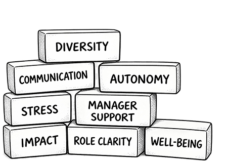
Friday uses PERMA+, a research-backed framework from positive psychology developed by Martin Seligman. It covers Positive Emotions, Engagement, Relationships, Meaning, and Achievement, plus a "+" layer that captures the conditions around work, like health and context.
We use PERMA+ as a map. Not to score people, but to make sure feedback lands in a structure that is consistent over time. It helps separate signals that otherwise get mixed, such as low energy, low clarity, and low connection, and it gives teams a shared language for what is going on.
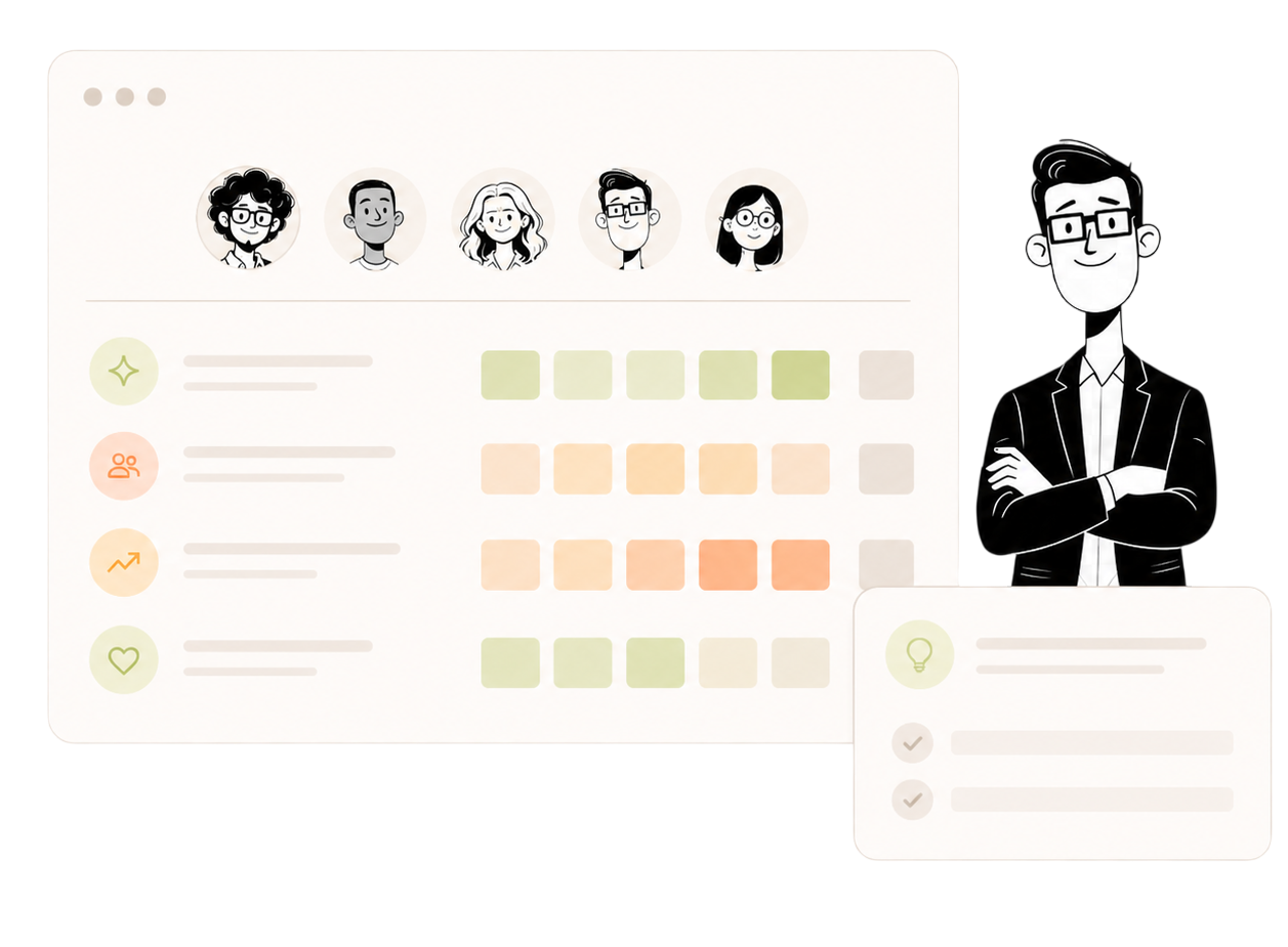
Use these cards when a page needs to group related models, categories, or framework layers.
Our drivers are built by mapping what employees write and rate to the PERMA domains, then using the "+" layer for practical conditions that strongly affect day-to-day engagement.
Personal well-being.
Compensation, equipment, work environment, work flexibility.
This is where a lot of practical friction lives. The point is not to over-measure, but to keep categories tight enough that feedback can be interpreted reliably.
Diversity & Inclusion is included as a topic within Workplace Relationships because it directly affects belonging, respect, and day-to-day collaboration.
It is not part of the original PERMA+ framework as defined by Seligman, but it is important to organisations that work deliberately with inclusion and fairness. In practice, stronger inclusion supports stronger relationships, better collaboration, and a more consistent sense of belonging across teams.
Use this pattern when a section needs a strong left-hand message and a right-hand list of benefits, checks, or capabilities.
Give each point one job and keep the supporting copy short.
Use icon-led bullets for trust, governance, and employee confidence.
Make every bullet connect the product capability to a next step.
Friday does not just use research to decide what to recommend. We use it to shape how recommendations are made, so they feel realistic to act on and support how trust and engagement are built in real teams.
Amy Edmondson's work on psychological safety acts as a filter for recommendations. It helps ensure suggested actions are safe to take and do not unintentionally increase fear or silence in a team.
Employee recommendations often focus on small, low-risk steps: asking for clarity, raising friction early, testing assumptions, or requesting support without escalating conflict. Manager recommendations focus on responding in ways that protect safety while still addressing the issue.
Simon Sinek's work shapes how Friday frames recommendations around leadership, trust, and clarity. The core idea is that engagement follows trust, and trust is built through everyday behaviour.
When feedback points to confusion, overload, or tension, the recommendation is not simply "communicate more". It gives guidance on how to lead in a way that builds trust, increases clarity, and supports shared responsibility.
We lean into Scandinavian collaboration norms because AI recommendations otherwise tend to drift toward two unhelpful extremes: very individual advice, or very one-sided organisational advice.
In flat, high-autonomy teams, engagement is built through shared responsibility, good communication, and clear agreements. Friday's recommendations support dialogue over assumptions, collaboration over silos, shared agreements over vague expectations, and responsibility that is distributed rather than dumped on one person.
Use this pattern when a page needs a short positioning moment before cards or proof sections.
Most employee surveys are built around questions and ratings — lots of them. This leads to survey fatigue, shallow answers, and too much guesswork. Friday starts with what employees actually want to share.
Use these cards for compact product explanations, benefits, and visual proof blocks.
Two feature cards
Stop asking multiple questions and instead let reflection naturally reveal what's slowing teams down and what helps.
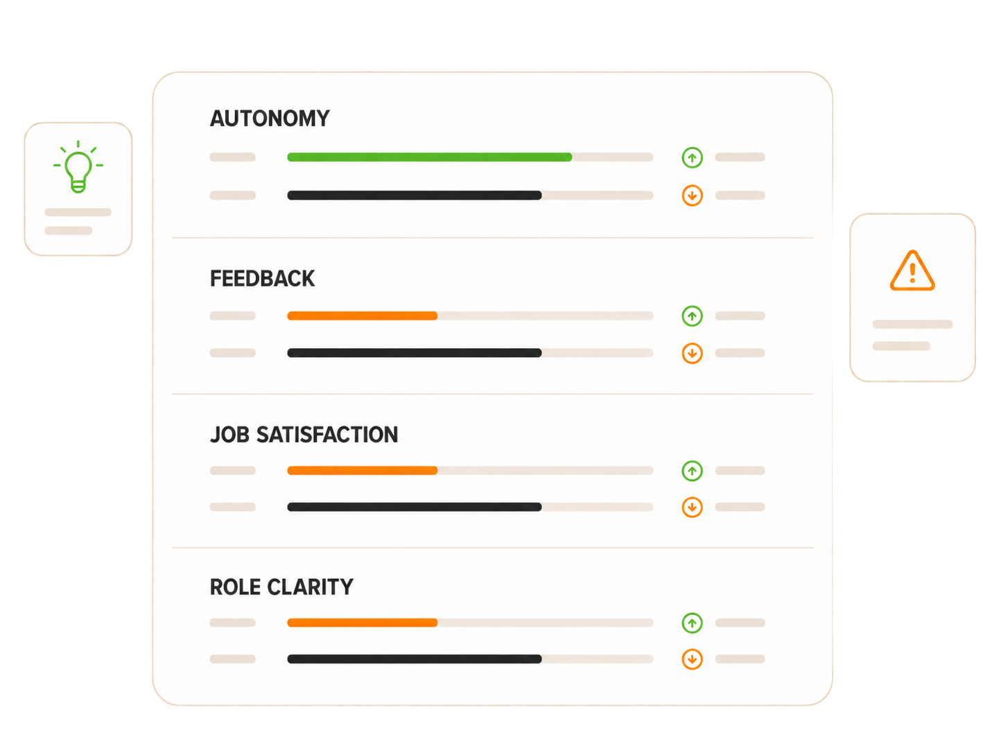
Feedback is structured into well-being categories, giving a clear picture of what matters and where attention is needed.
Three compact cards
Set clear privacy levels for feedback. Employees always know what is visible and feel safe to share.
Learn more about privacy levels →Track employees well-being and quickly see improvements, declines, and unresolved issues.
Learn more about trends →Based on what employees share, Friday turns reflection into concrete next steps for both employees and managers.
Learn more about recommendations →Use this pattern when a page needs social proof without taking over the entire page.
Friday™ kept engagement high and made it easy to act on feedback.

Use the AnimatedQuote component when a single voice carries the section. Words fade in with a stagger when scrolled into view. Pass two or more quotes to enable an auto-rotating carousel with pagination bars; the rotation timer waits until the first quote has fully revealed.
Default — single column
The default size sits inside narrow editorial columns at 1.5rem serif italic. Pass an array of quotes to enable rotation; pagination bars and the 10-second progress fill appear automatically.
“Friday's AI takes a brief comment and turns it into genuinely personalised guidance. That's the difference.”
Full-width — large
Use the large variant for hero-scale moments where the quote is the section. Drops the body-column constraint and scales typography up. Works with one quote or several.
“When I looked back at my recommendations, I realised they were actually really good. Concrete things I could do.”
This uses the same Tabs and TabPanel components as the front page, including the moving active underline.
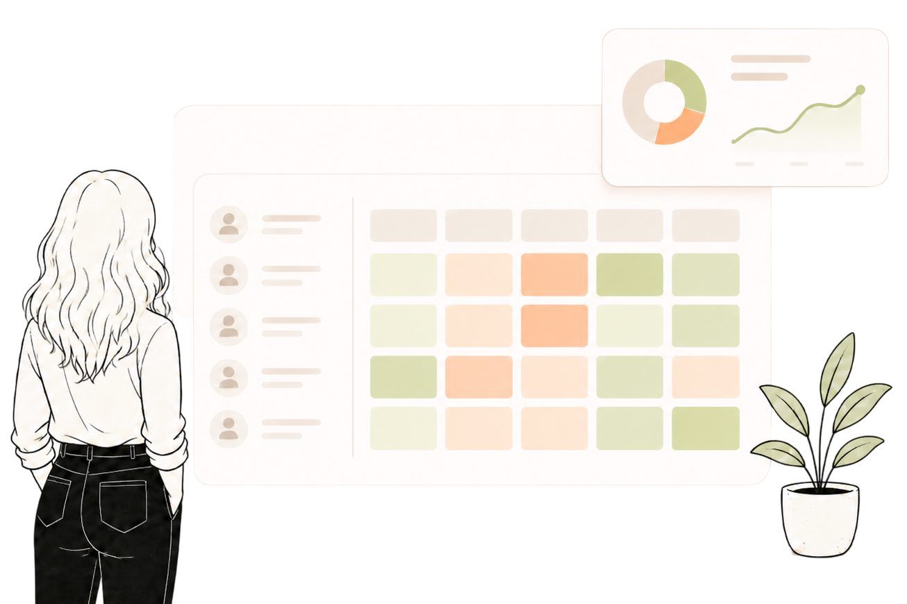
You don't just see when something's off. You see what's driving it. Friday gives real-time insight across teams, so you can spot issues early and support managers with targeted actions.
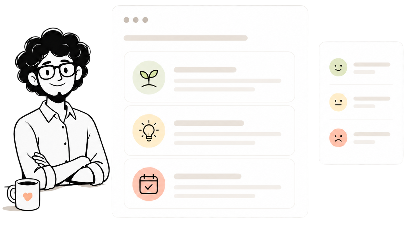
No more answering a bunch of questions. Instead, you get a moment of reflection that gives you practical, personal recommendations based on your specific situation and your own words.
Catch friction early and remove it. Friday groups team input into clear themes and suggests how to address them with confidence in 1:1s and team meetings.
The cost isn't "soft." Disengaged employees can cost up to 34% of salary via lost output, turnover, and absence. Friday helps you catch the signals early and gives clear actions to address them.
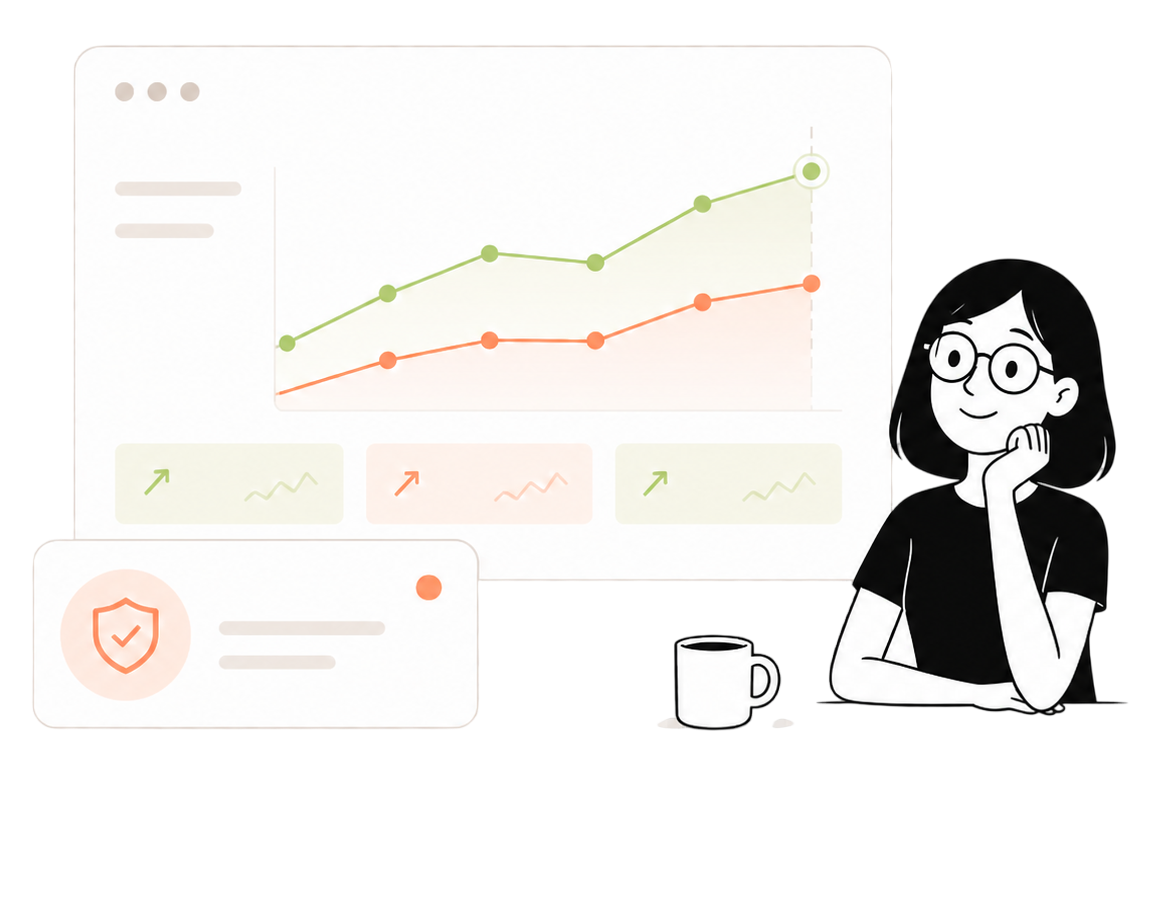
Use animated proof numbers when the page needs evidence without a heavy reporting layout.
Use this compact row when a narrative section needs evidence at a glance, with delayed sweep motion.
Use this when the surrounding page should stay open and calm.
Friday is built on PERMA+, a research-backed framework for human wellbeing developed by positive psychologist Martin Seligman. It covers Positive Emotions, Engagement, Relationships, Meaning, and Achievement, alongside additional dimensions including physical health and vitality.
To make sure Friday reflects the full reality of modern working life, we have expanded the framework with additional sub-drivers and a main driver based on experience and best practice from real organisations. Most engagement tools measure broad satisfaction and leave you guessing at the cause. By mapping what employees actually write to these specific drivers, Friday tells you not just that something is off but which part of working life it connects to. That is what makes the recommendations specific rather than generic.
You choose the privacy level that fits your culture. Friday offers three options:
Every employee can always see which privacy level their organisation has chosen, so nobody is ever left wondering how their input is being used or who can see it.
Friday's guidance is shaped by research on psychological safety (Amy Edmondson), purpose at work (Simon Sinek), and the Scandinavian tradition of dialogue and employee involvement. It is not a black box: employees can review and correct how their input was interpreted, and every suggestion is tied directly to what the person wrote. Think of it as an experienced HR business partner who has read every comment and has a concrete suggestion ready for each one.
You do not have to replace what you already have. Some teams run Friday as their always-on habit between annual measurement cycles. Others replace their existing setup entirely because Friday covers the same ground with less friction and more context. Either way, it is built to work with how you already operate, not against it.
Most teams are live within a few hours. Friday offers self-serve setup or free guided onboarding, whichever fits your pace. No IT project. No six-week implementation plan.
The free trial includes 2 full rounds at your own cadence, no credit card required. For larger organisations, get in touch and we will put together the right setup.
Use a true full-bleed dark band when the page has delivered enough context and should move the reader toward action.